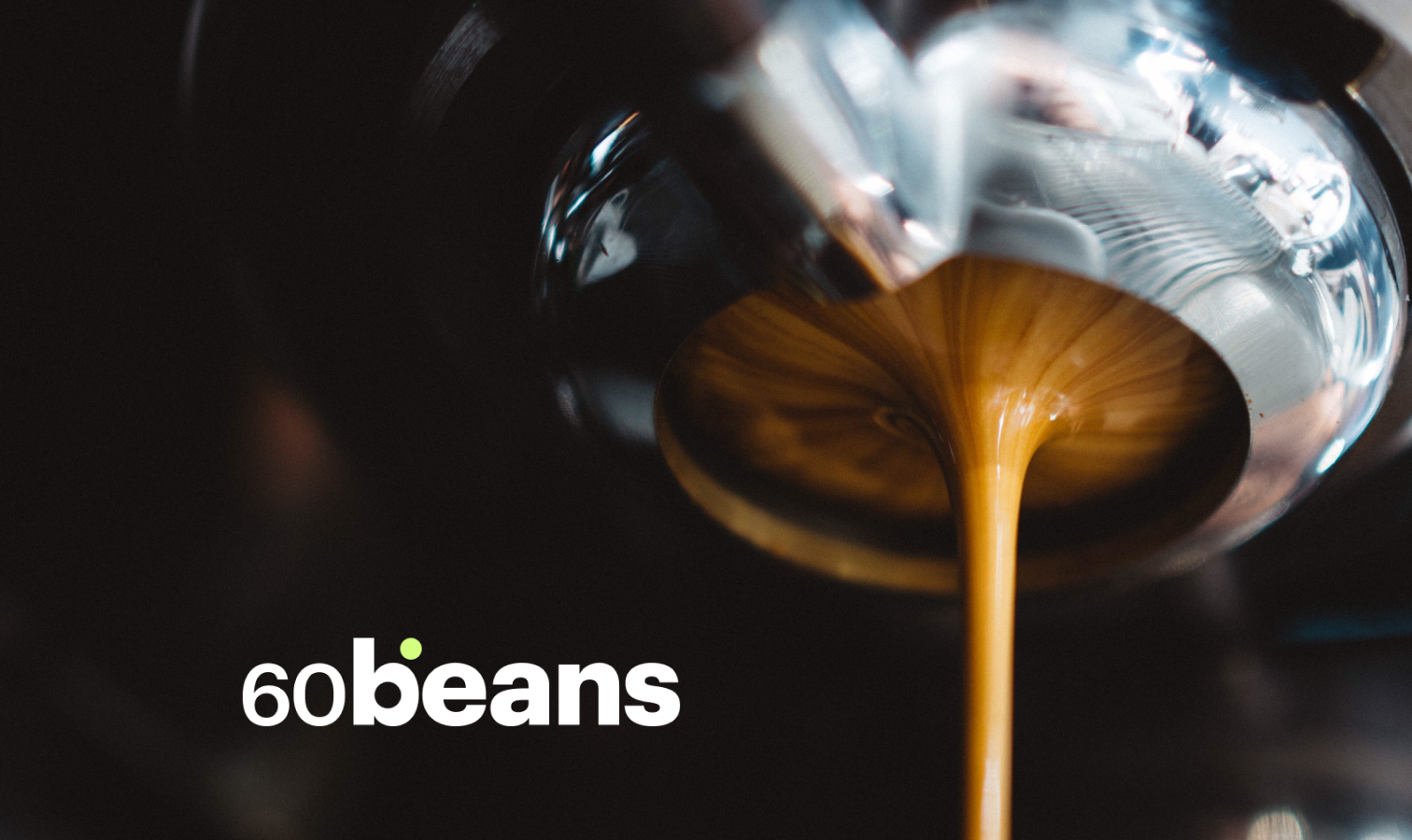
A Brand Built to Hold Space
Overview
The brief was brand identity and digital platform from scratch. What made it compelling was the constraint. The brand had to be bold enough to lead, open enough to build a community, and generous enough to let the roasters at its heart take centre stage.
This project was developed in close collaboration with the creative director and the experience design director
Distinctive without dominating
Independent roasters bring their own visual worlds: strong identities, loyal communities, distinct aesthetics. A platform brand that competes with that energy risks losing the very partners it depends on. One that disappears into the background fails to build the trust that makes it worth visiting at all.
So the work started not with visuals, but with the culture itself. How enthusiasts talk about coffee, how roasters position themselves, what already carries meaning in this world. The goal was to speak from within it, not describe it from the outside. Together with the strategic designer, I facilitated a Brand Design Sprint with the core team and key stakeholders. A focused three-hour session that translated those insights into four defining attributes: best-in-class, emotional, crafted, smart.
Not as a manifesto. As constraints.
Two directions. One clear answer.
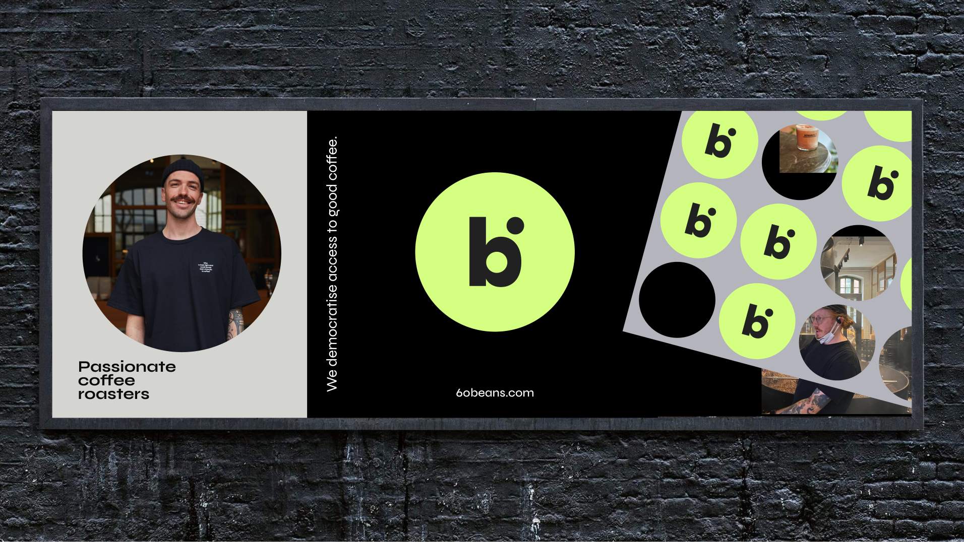
The visual exploration produced two distinct territories. The first was bold, geometric, black and green. It led with conviction: high contrast, contemporary, built for longevity. The second leaned into coffee's sensory richness, with warmer tones, organic textures, and an intimate register. Beautiful. Right for a single roaster. Wrong for a platform.
The bold direction offered something the warmer one couldn't: a strong visual frame that could hold many different roasters without competing with any of them. Structured at its core, with room for colour and character to come from the brands it features. A platform identity that supports its partners rather than overshadowing them builds the kind of trust that keeps both roasters and customers coming back.
Restraint as a design principle
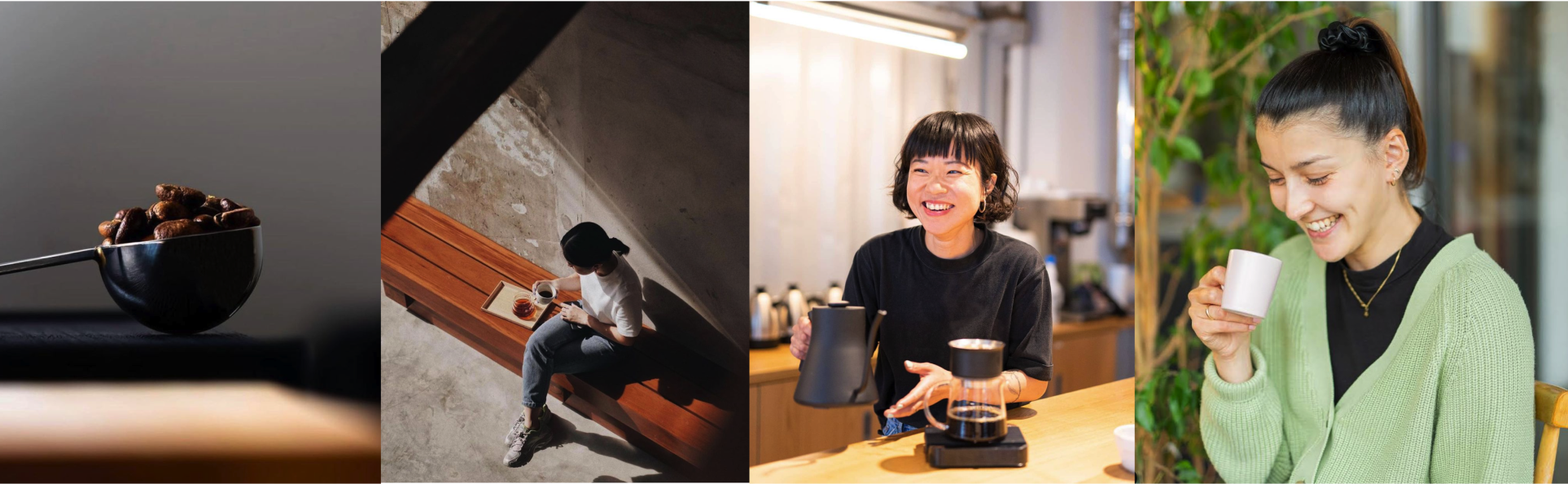
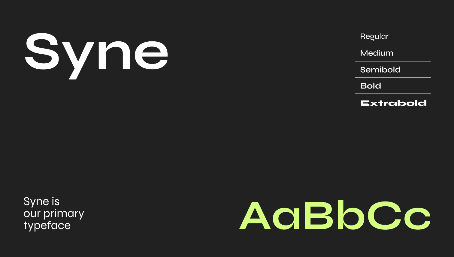
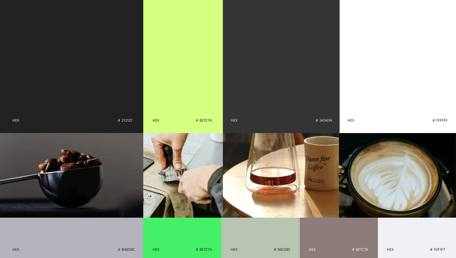
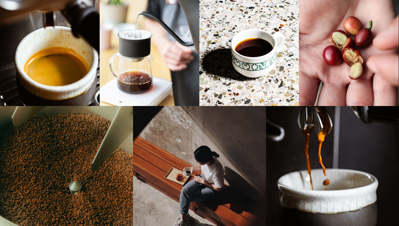
The identity was built around a tight typographic system, a palette anchored in deep black and warm brown, and a clear photography direction. Real people, real moments, no lifestyle gloss. The warmth had to feel earned. The boldness had to stay useful.
A brand that holds its ground without taking up too much room.

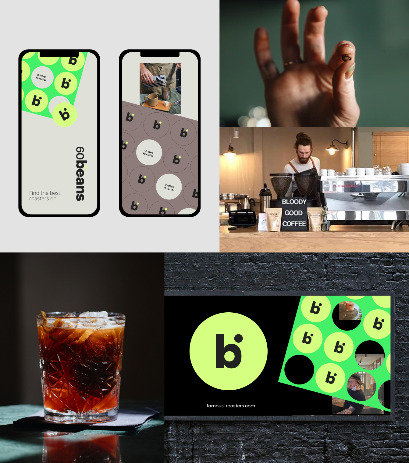
Where the brand becomes a place
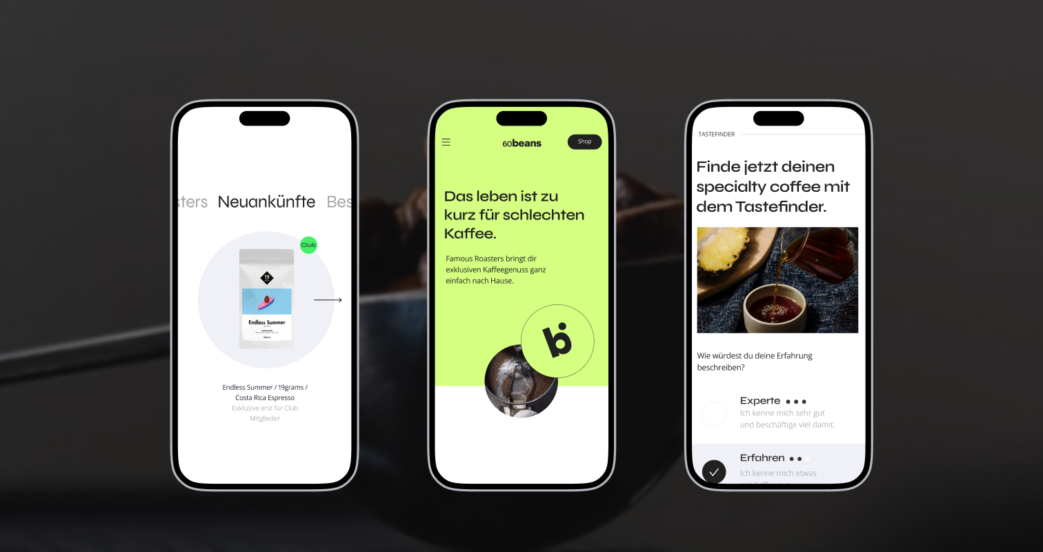
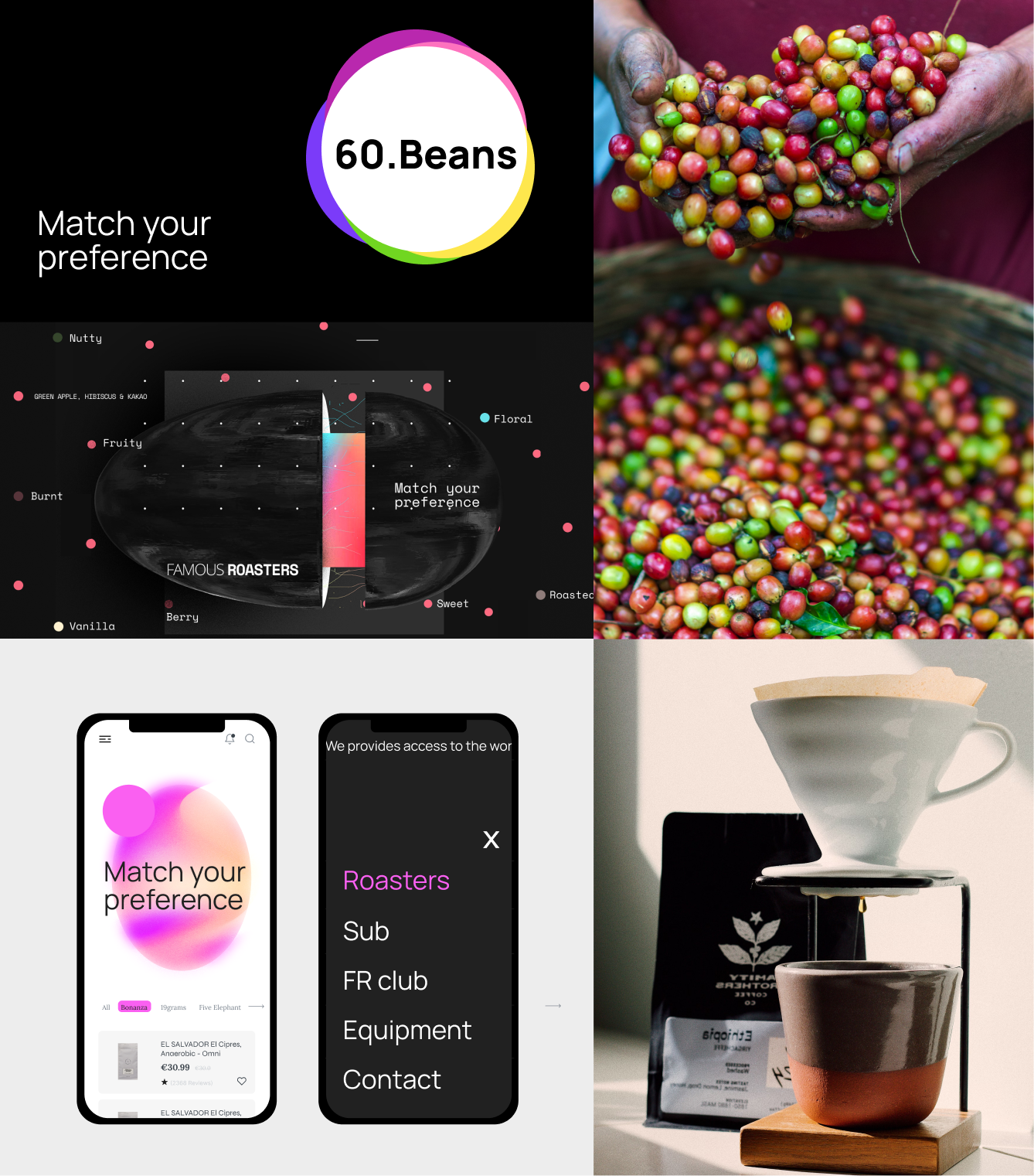
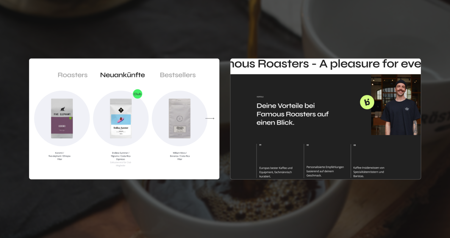
Translating the brand into a digital platform meant making the same decisions all over again: hierarchy, visibility, tone. The interface needed to carry the identity without performing it. Structured layouts, deliberate spacing, a visual language that creates atmosphere rather than just consistency.
The focus here wasn't product design but brand application across a living digital environment. From homepage storytelling to partner showcases and content-led discovery. The visual system extended into layouts, interaction moments, and branded content that feel cohesive whether you're browsing on desktop or returning on mobile. A space that communicates what 60Beans is before you've read a single word.


A brand system ready to grow
60Beans launched with a brand and platform ready for what comes next. The visual identity, digital presence, and content system were built to grow together: bringing on new roasters without losing coherence, expanding into new markets without starting from scratch, and building a community with a consistent voice across every touchpoint.
The brief asked for identity and interface. What was delivered was a foundation the whole team could build on.