Designing the Foundation Under a Moving Company
Overview
I joined the marketing team as a senior designer and, in the absence of a defined creative lead structure, took ownership of the brand direction. What began as a refresh became something larger: a marketing design system built from the ground up, created in parallel with the work it was meant to support.
Developed in collaboration with an internal senior designer specialising in illustration and motion, a product design lead, and a small team of junior and multimedia designers.
From energy to architecture.
Fast-growing companies accumulate visual debt. At CoachHub, a bold brand identity had served the startup phase well, but as the company expanded across markets and content types, the cracks began to show. Different teams made different decisions. Assets weren't consistent. The brand was energetic but hard to scale.
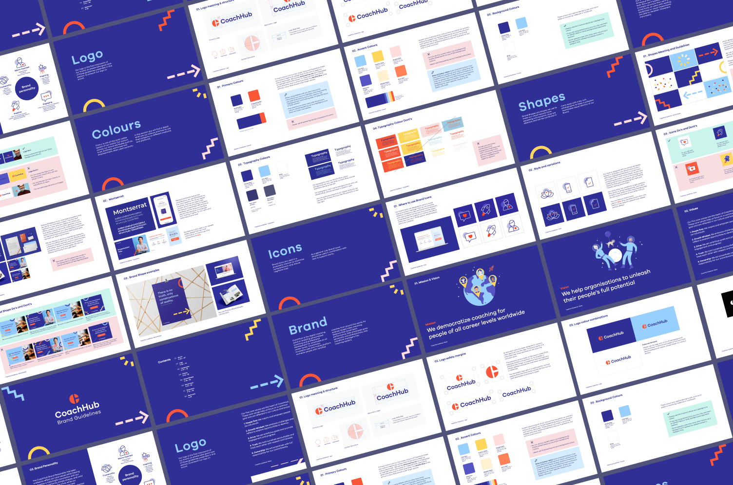
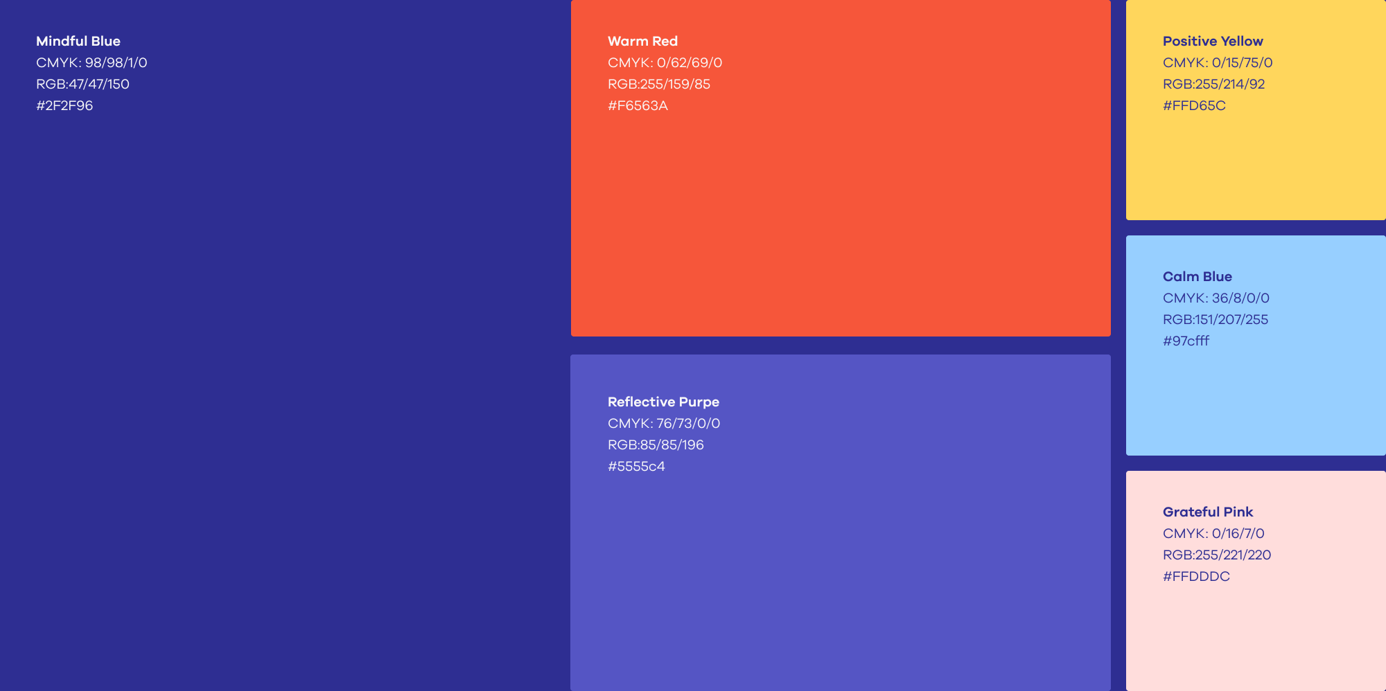
The challenge wasn't to start over. The logo stayed. What needed to change was everything around it: how colour was used, how typography behaved across formats, how photography was directed, how data was visualised, and how all of it could be documented into a system a growing team could actually use.
A refresh built from the inside out.
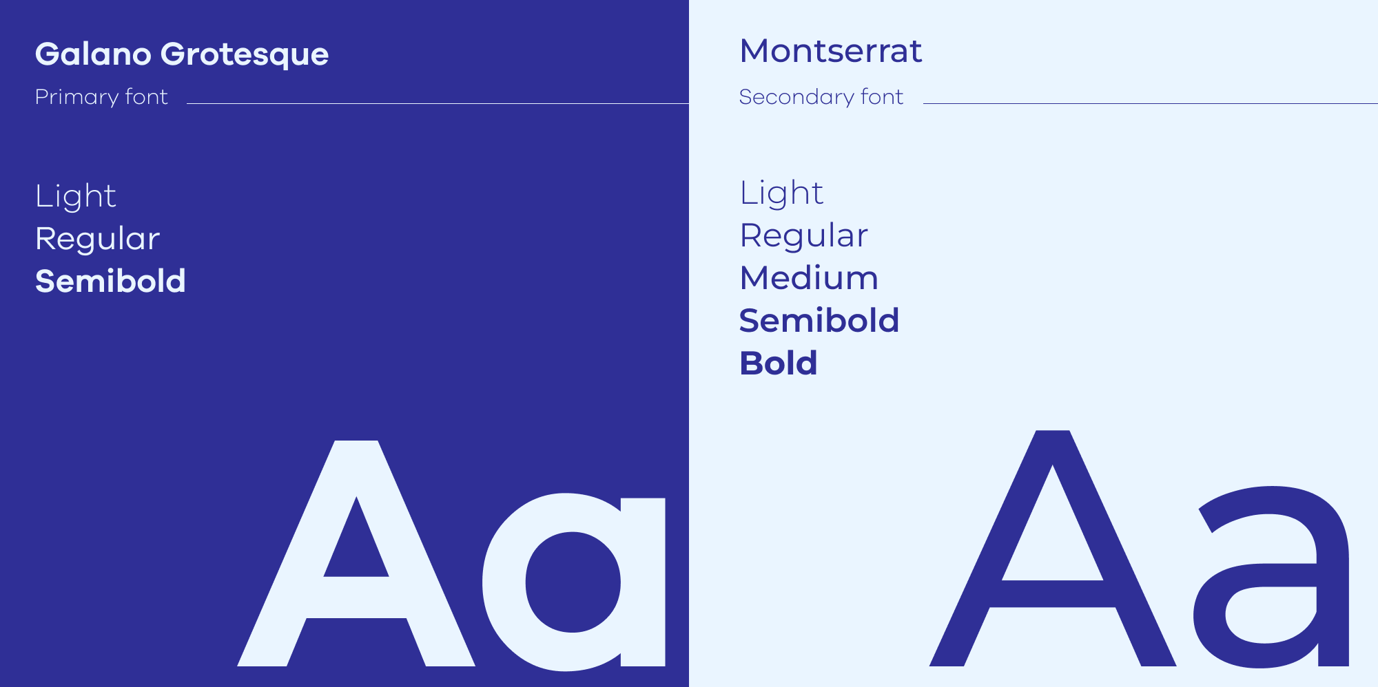
The work began with a visual audit and workshops to understand where the brand had drifted and what it needed to become. Colour ratios were redefined for consistency across marketing and product. Typography was clarified: two typefaces, each with a defined role. Photography direction shifted toward images that felt active and human. A custom icon collection brought coherence to a part of the brand that had been fragmented, developed in close collaboration with a senior designer specialising in illustration and iconography.
Each decision was documented as a living foundation. Something the team could build on.


One system, many surfaces.
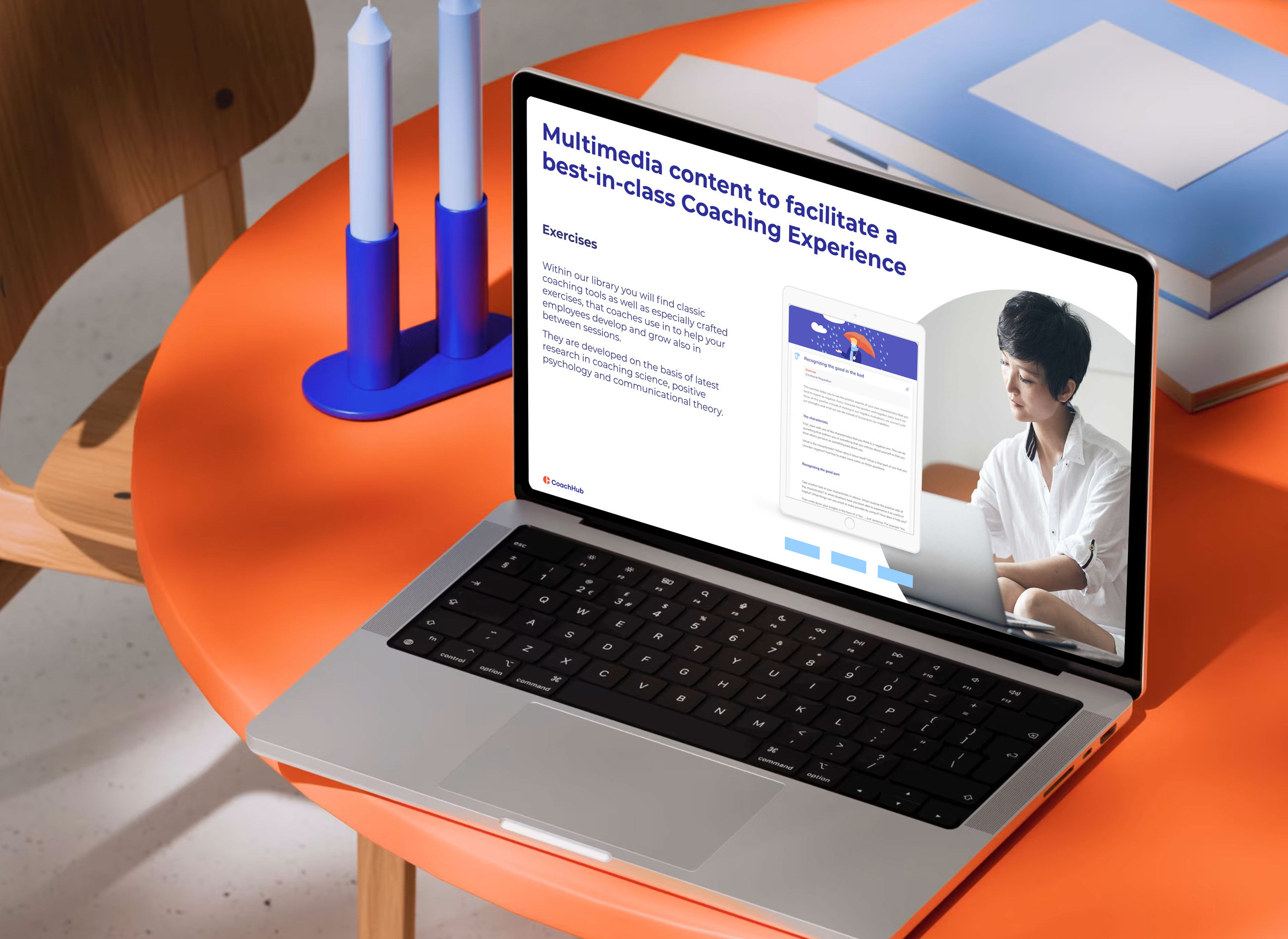
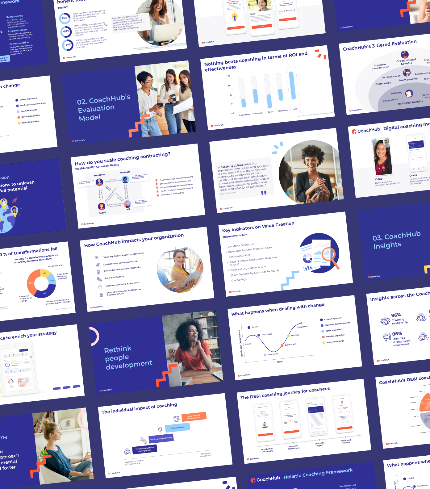
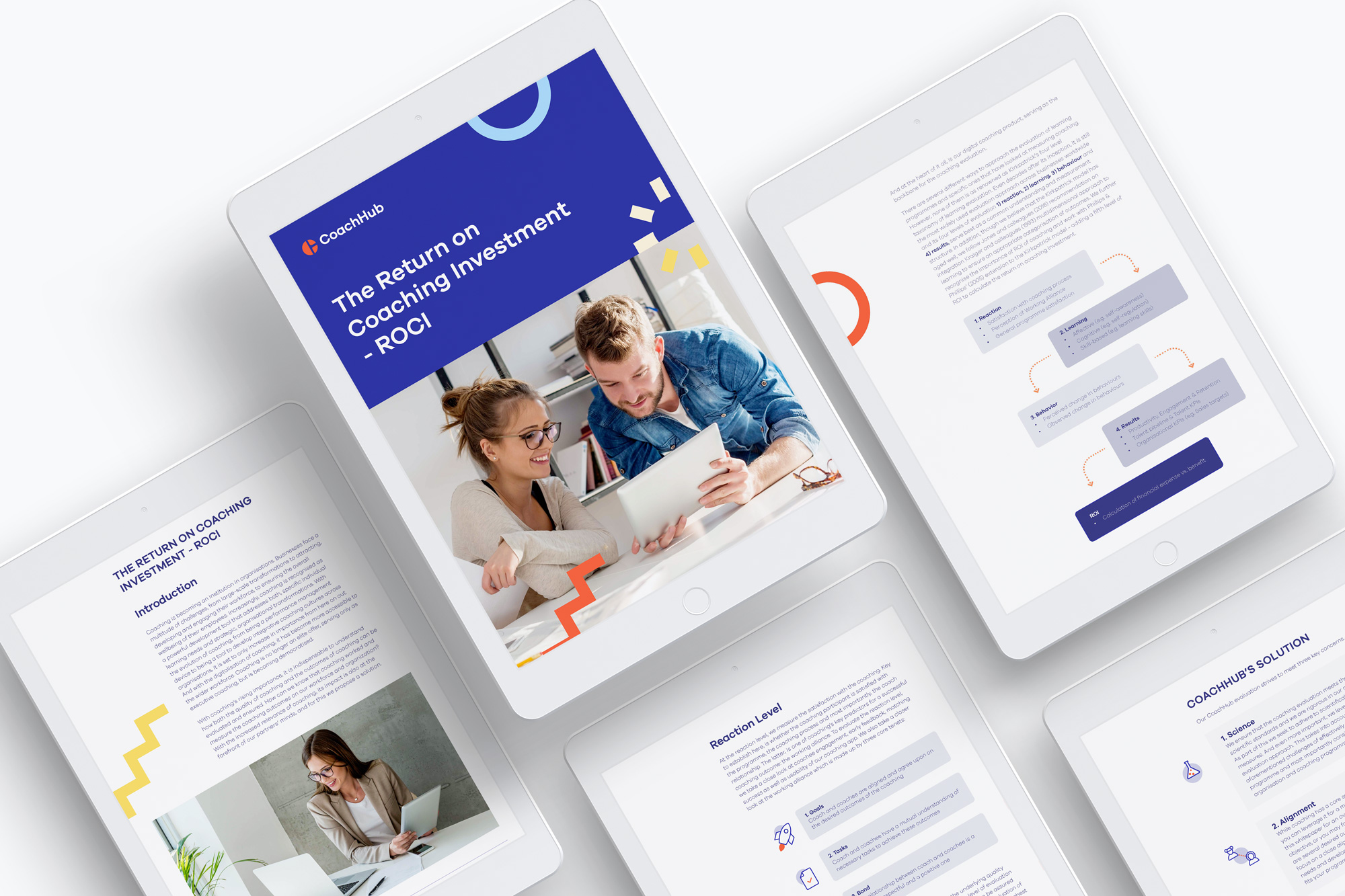
With the foundations in place, the real test began. A collection of over 400 presentation slides spanning product storytelling, research insights, data visualisation, and sales enablement became the place where the design system was stress-tested and made real. Every layout, every data format, every typographic choice was a system decision in practice.
The work extended into digital marketing assets, editorial content, newsletters, whitepapers, and campaigns across every screen size. A brand that had started as a collection of instincts became something a whole team could navigate.


A foundation a team could build on.
What CoachHub needed wasn't a more beautiful brand. It needed one that could be used consistently by people who weren't designers, across teams, time zones, and content types. A documented visual language, a Figma-based asset library, and content templates that reduced the decision-making load for everyone who came after.
The brief was a refresh. What was built was the infrastructure for how CoachHub communicates.
