What Ten Years Did to a Reef
Type Self-initiated · Master's thesis · 2019
Overview
The question I kept returning to wasn't what was happening to coral reefs. The science was there. It was why so few people seemed to feel it. Ocean conservation in 2019 was significantly less visible than other environmental causes. Corals were disappearing quietly, and the urgency wasn't travelling. Design can build the bridge between what science knows and what people feel. That felt like the right way in.

Making the distant feel close.
Research into climate communication kept surfacing the same insight: people tend to perceive environmental threats as happening far away, to other people, at some future point. Coral bleaching suffered from exactly that distance. Informing people wasn't enough. The work needed to make them feel something first, and then give them somewhere to put that feeling.
Where two billion people start their day
Research into climate communication kept surfacing the same insight: people tend to perceive environmental threats as happening far away, to other people, at some future point. Coral bleaching suffered from exactly that distance. Informing people wasn't enough. The work needed to make them feel something first, and then give them somewhere to put that feeling.
Building the coral world.
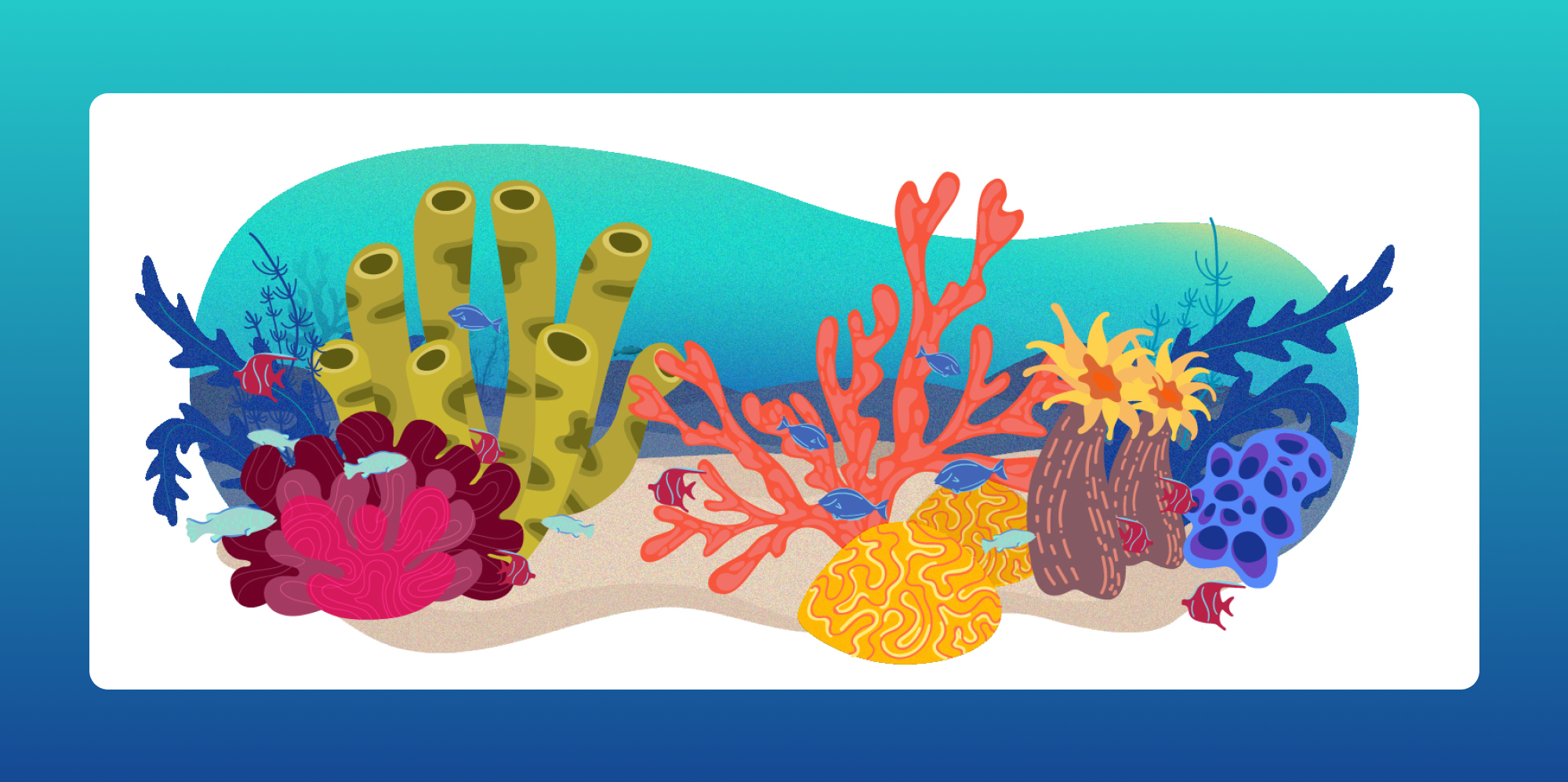
The visual direction needed to hold two things at once: the beauty of what exists and the weight of what is being lost. Playful enough to invite curiosity. Honest enough to matter.
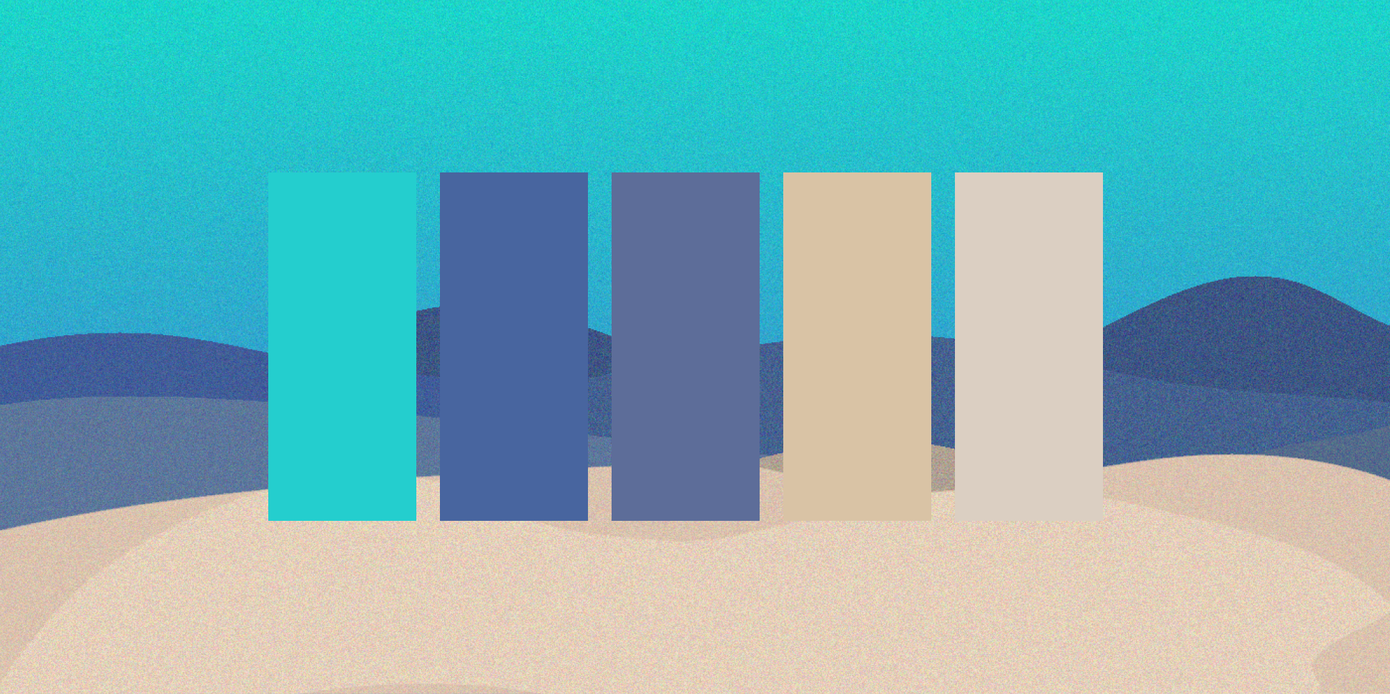
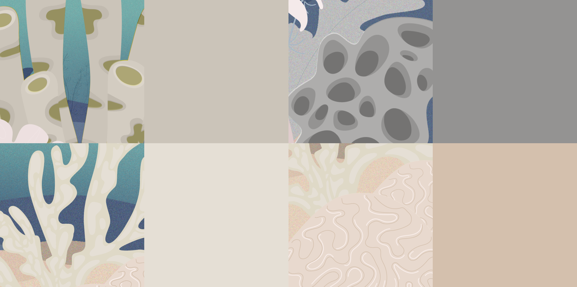
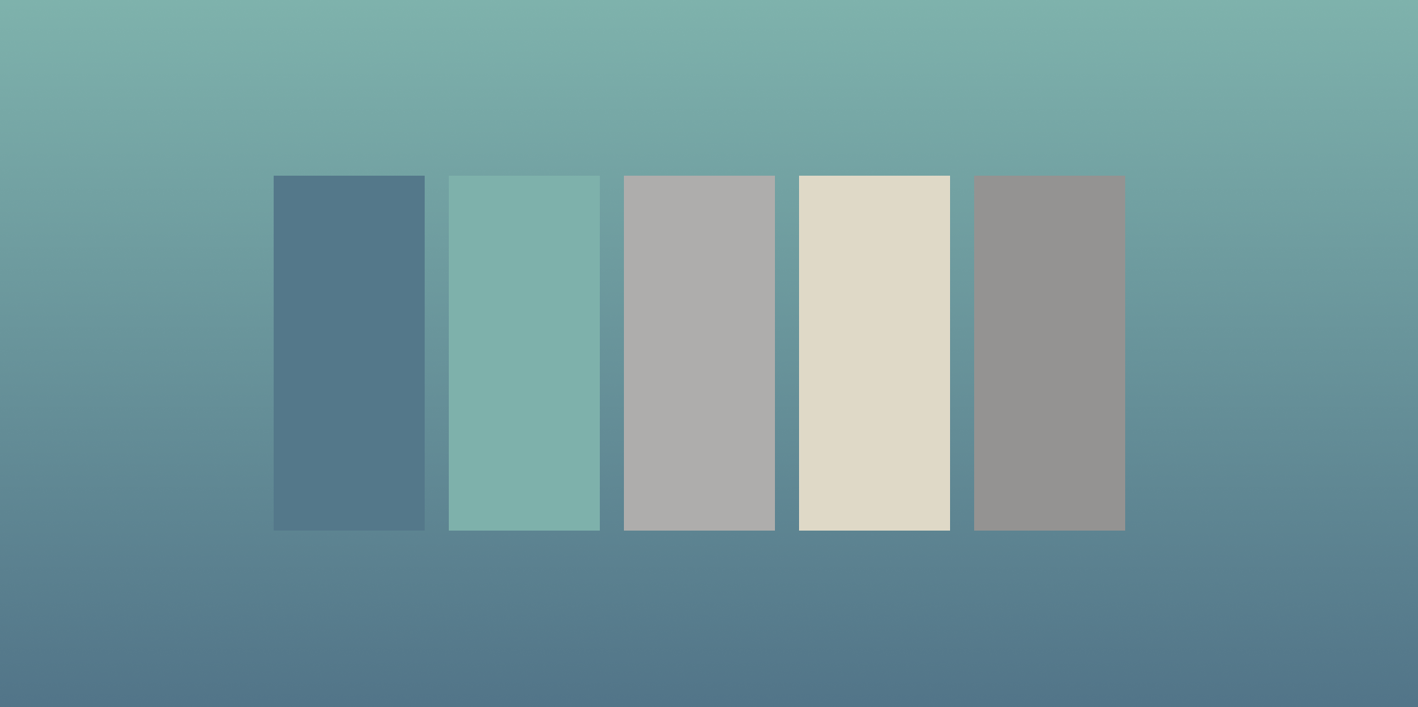
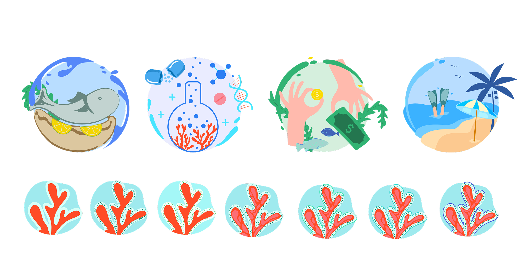
Colour was the primary storytelling tool. As the animation unfolds and the causes of bleaching are named, the reef slowly drains of colour. The vibrancy fades to pale grey and muted beige. Then, as viewers choose their actions, colour returns, restored by participation. The palette carries the full emotional arc of the piece: abundance, loss, and the possibility of return.
Soft, organic forms make the reef feel like somewhere you could belong, not a system to understand but a world to care about. That choice was deliberate: the closer something feels, the harder it is to ignore.

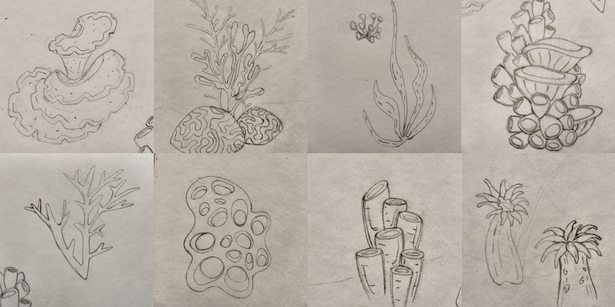
Sketches and storyboard shaped the narrative arc
A thriving reef, the causes of bleaching, the slow fade, and finally the moment where the viewer becomes part of the story. Script, storyboard, and all illustrations were entirely my own. Animation and interaction were brought to life in collaboration with an external specialists I brought in for the project.
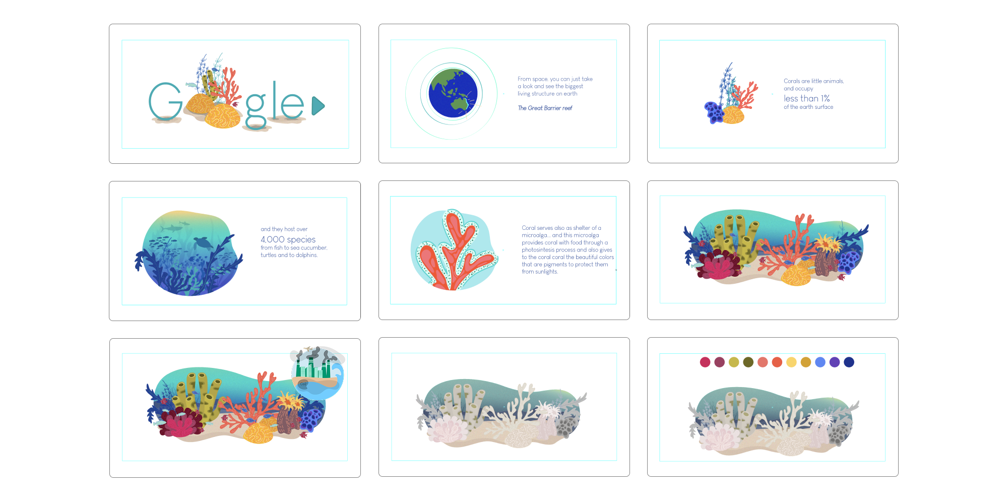
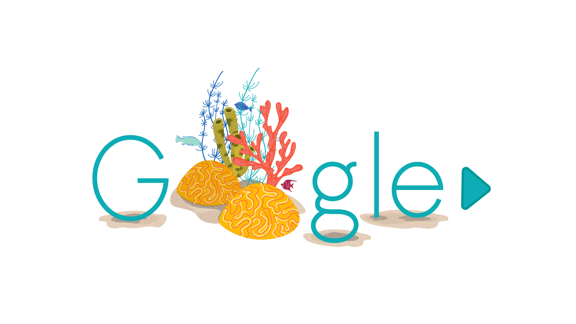
The Doodle
The animation opens on a living reef. As the story unfolds, bleaching plays out: warming water, coral stress, the slow fade to white. It does not end there. Viewers choose from a set of real actions, things they can genuinely do, that have a measurable impact on ocean health. With each choice, colour returns to the reef. Small actions, made visible.
Making something worth sharing.
This project was designed to be real. Developed as a Master's thesis, it was built with the ambition of a live campaign: find the medium with the most reach, make the experience worth completing, give people something to do with what they feel.
That brief I set myself. It is the kind of problem I keep coming back to. Because the most powerful thing design can do is make people feel close to something they assumed had nothing to do with them. That is what this was trying to do. That is what I want the work to keep doing.The concept is ready.
If you have a connection to the Google Doodle team or work in ocean conservation and see a possibility here, I would welcome the conversation.