When the Brand Explains the Science

Overview
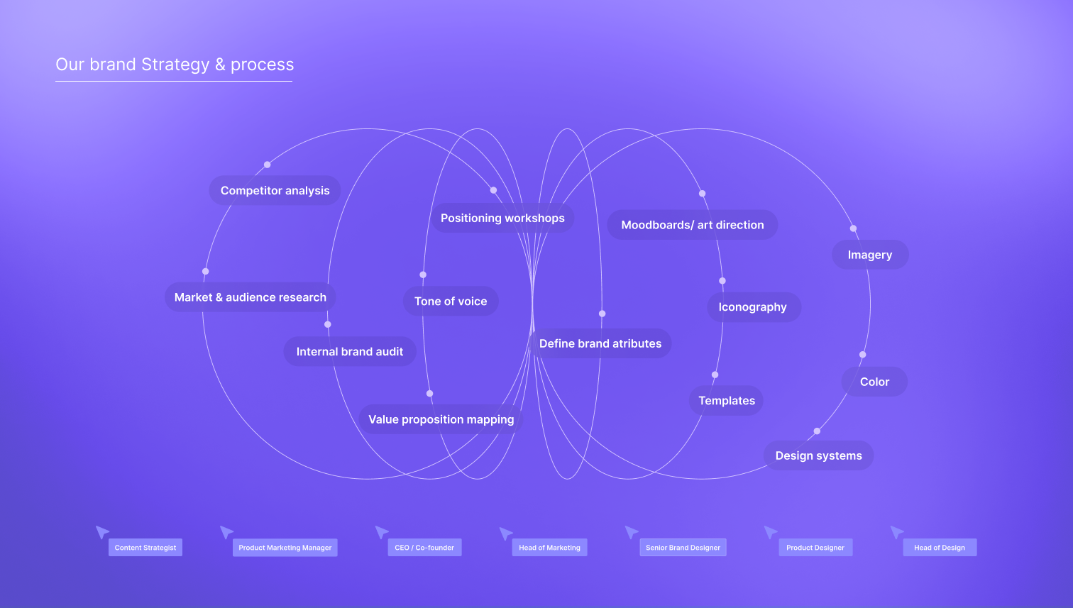
I worked as senior brand designer alongside the head of design and product marketing, developing the visual identity and building the systems, tools, and assets the brand needed to communicate across clinical, commercial, and investor contexts. The work spans identity and colour, iconography, imagery direction, editorial design, infographics, and motion. Each piece doing the same job in a different medium: making something genuinely complex feel clear.
Trusted by clinicians, understood by everyone
AI-powered radiology is hard to explain and even harder to show. The technology is invisible by nature: algorithms, processing, pattern recognition happening in milliseconds inside a scan. The audiences deepc needed to reach were also very different from each other: radiologists who needed technical credibility, hospital administrators making procurement decisions, investors evaluating potential.
One visual language had to work across all of them. Authoritative enough to belong in a clinical environment. Clear enough to explain the product to someone encountering it for the first time.
A visual language for invisible technology.
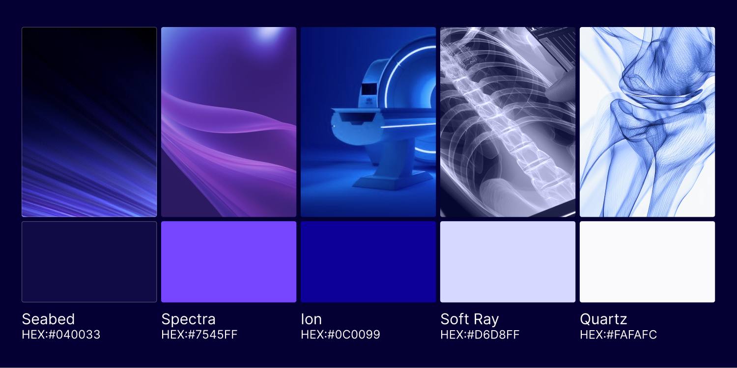
The identity was built around clarity as a design value: structured typography, a precise colour palette, and a set of visual principles that could carry the brand across very different surfaces without losing coherence. The work was grounded in what the technology actually does, improving workflows for radiologist and fastest and acurated outcomes for patients, rather than defaulting to the generic visual language of the tech industry.
To develop the imagery direction before photography was available, I used AI-assisted image generation as an art direction tool, translating brand attributes into visual references to guide future photography and campaign work. These appear in the portfolio as directional exploration, a way of thinking through the visual world of the brand before it could be fully produced.



Making complexity readable.
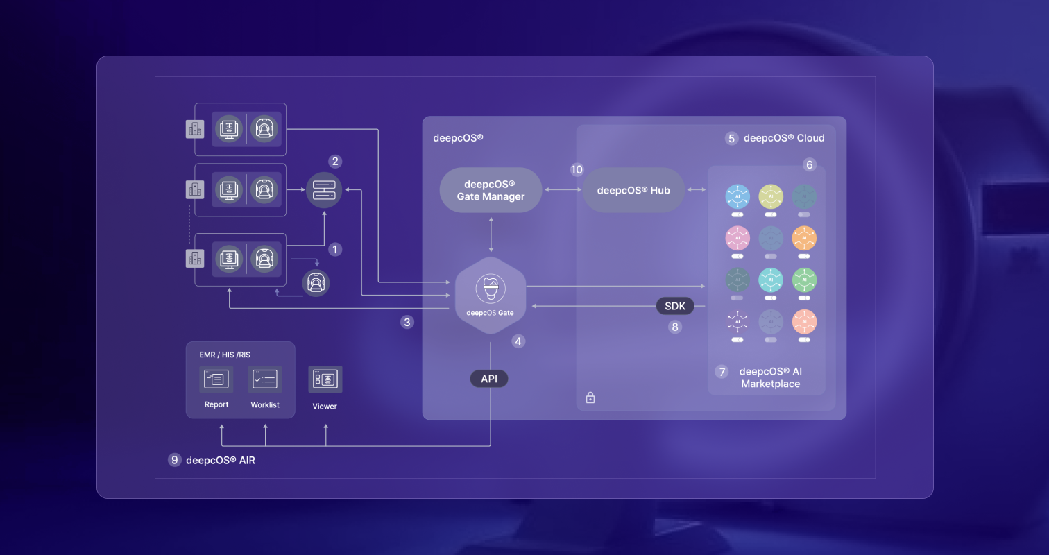
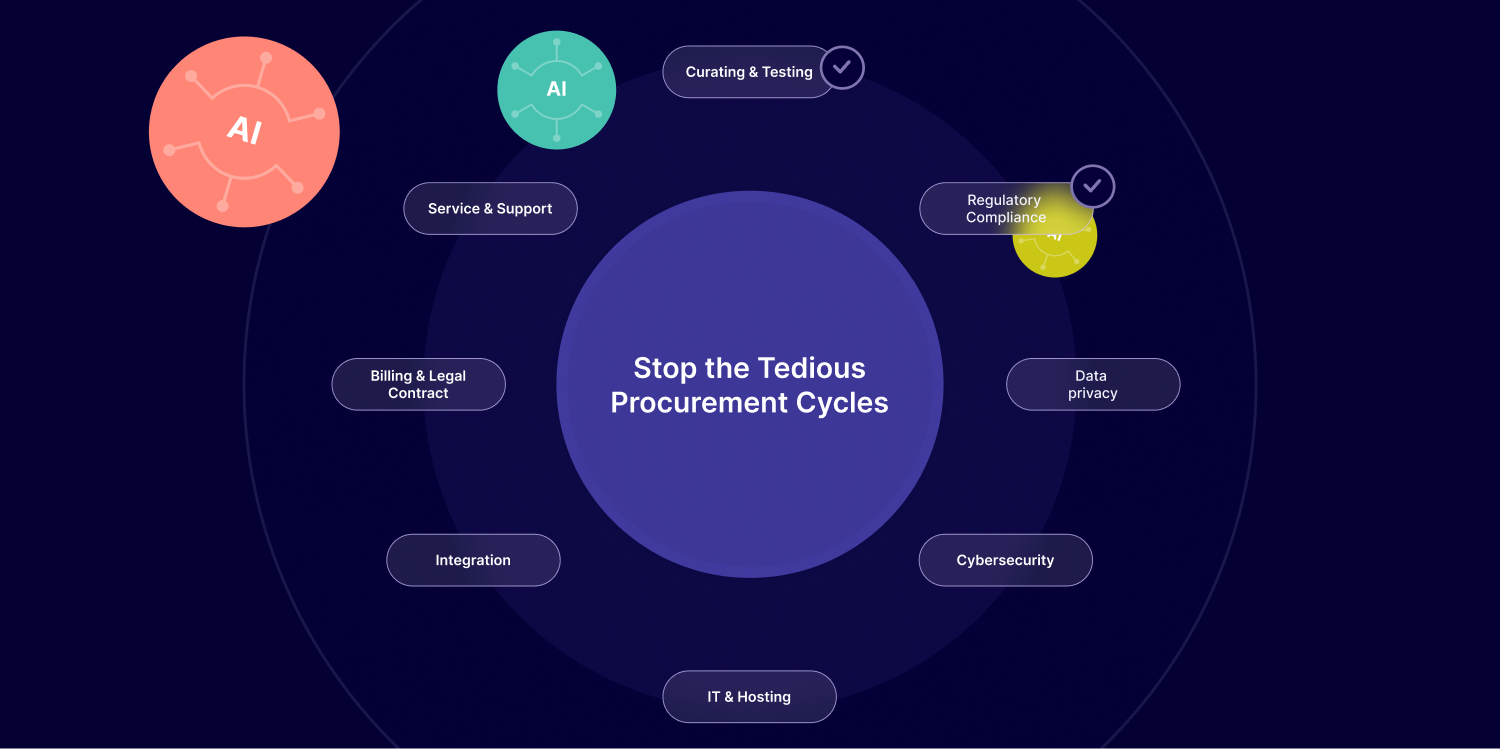
A significant part of the work was building tools for communication rather than just assets. A custom icon set gave the team a visual vocabulary for concepts that had no existing visual form, AI detection, workflow integration, clinical accuracy. Diagrams and infographics translated data and process into formats that could live inside a sales deck, a brochure, or a conference presentation without losing their clarity.
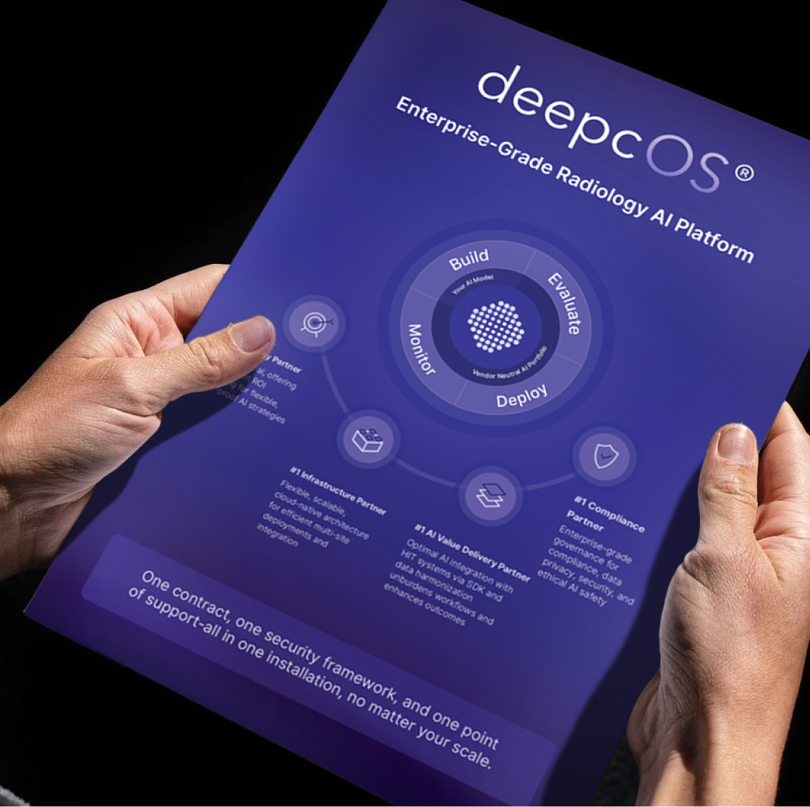
The editorial work, brochures, reports, and content formats, brought the full system together: colour, typography, iconography, and imagery working as one. From detailed product documentation to large-format conference applications, the brand held its character at every scale.



From brand system to moving story.
The explanatory video applied everything the visual system had built, iconography, motion principles, information hierarchy, to the most demanding brief: a two-minute narrative explaining how AI changes the work of a radiologist, for an audience that ranged from clinicians to executive buyers.
I led the work from script analysis through storyboard development, moodboard, and creative direction of the animator. The video relies entirely on motion graphics, iconography, and diagram animation, no live footage. Every element came from the visual language already established, tested now under narrative pressure and in motion.
The video achieved a 55% engagement rate against an industry norm of 30 to 35% for content of this length.


A brand that could do the explaining
The visual system gave deepc's teams a shared language for the product, for the science, for the story of what the technology makes possible. Iconography, editorial tools, and content formats that non-designers could use consistently. A brand that worked at a conference stand in front of a thousand people and inside a two-page brochure on a desk.
Some executions shown here were refined and extended for portfolio presentation to demonstrate the full potential of the system. The original work and portfolio extensions follow the same visual logic throughout.